
 by
by
City logos are things we rarely ever think about.
Royal Oak's is a transparent R connected to an O — kind of like a curvy Rx symbol — surrounded by a circle filled in with red. People from there likley wouldn't be able to conjure it up if you asked. Wyandotte's involves some Windows 95-looking itallic font with the sketch of a Native American bowing his head (perhaps in shame?) above it. Also unrecognizable.
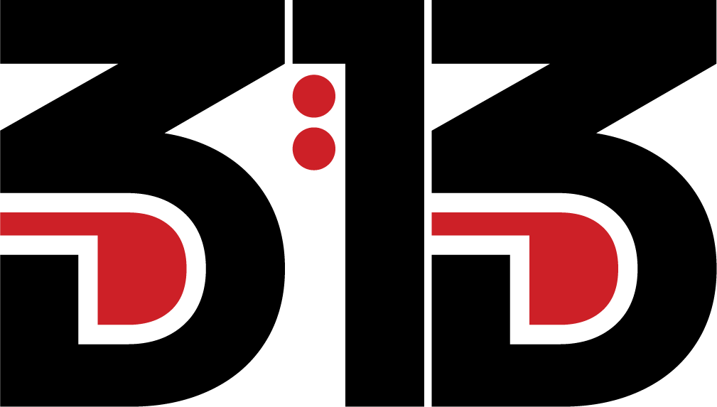
But it's a somewhat slow news day locally and Dearborn just unveiled a modern — though arguably aesthetically unpleasant — logo, and backlash over it is making headlines.
"What in the unnecessary modern design is this? This has nothing to do with Dearborn. The previous logo actually looked artistic," one person who seems to care said on Facebook.
"The old one was classy," said another. "This reminds me of a waste management company."
Bummer for Dearborn, which spent a YEAR developing that dissable D.
(D, apparently is also for defense, because a city official was in the comments trying to assure residents it would not replace the city seal — which sports a more vintage vibe with a model T or some other old-timey four wheeler pictured.)
The D, and its accompanying branding scheme, now lord over the city's website, and will presumably appear on city materials.
This, officials say, is the result of a "comprehensive and inclusive development process" that was aimed to "reimagine" the city and position it "as one of diversity, innovation and connectedness."
Nearly 2,000 residents and "stakeholders," including the local chamber of commerce, helped develop the brand scheme, the city says.
So eat your hearts out, haters: you may be outnumbered. But to be honest, you may have already lost for caring at all.